Colour Of The Year: Classic Blue Favours To Impress
Posted by B.Appleby on Mar 25, 2020
 The Pantone Color Insitute has a little pow-wow once a year and announces its colour of the year. It’s been doing this since 1990 and its impact on fashion, interior design and other trending industries is immeasurable. In its first year, Cerulean was selected and who can forget Merryl Streep’s monologue about that colour in The Devil Wears Prada.
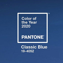
Last year’s colour was Living Coral and the number of design requests that came in for coral hues was definitely noticeable. So how about 2020? This year is Classic Blue.
OK, so the name is a bit of a yawn when compared to last year, or 2018 (Ultra Violet) or 2016 (Rose Quartz and Serenity) but what’s in a name? Pantone describes the hue as a restful colour that has the capacity to “highlight our desire for a dependable and stable foundation on which to build as we cross the threshold into a new era.” We’re not sure if Pantone’s crystal ball included the Coronavirus, but stability is something we surely need right now.
Leatrice Eiseman, Executive Director of the Pantone Color Insititute, goes on to describe Classic Blue as “a solid and dependable blue hue we can always rely on’. We’re not sure if she is casting shade on other unreliable blues (we’re looking at you Sky Blue) or that the human race is at such a juncture that we need a colour to keep us on an even keel, but when she describes it, you can’t shake the feeling that the meaning of life is being unveiled, a corner being peeled back ever so slightly.
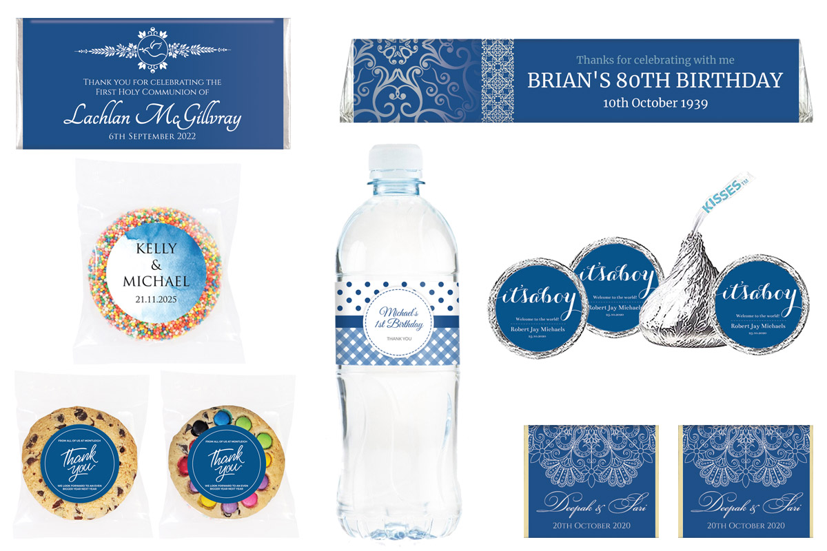
All of this navel-gazing aside, so what does this mean for your celebrations this year? Well, we’ve put together a few Classic Blue favour designs for you to consider. These can be used for almost any event, proving equally as suitable for weddings as they are for baby showers.


